Two bedrooms became three. The kitchen grew 54%. A new powder room appeared on the ground floor. We didn't add a single square foot to the footprint — we just stopped letting the layout punish movement. A short case study on why your home might feel off, and what changes when a floor plan starts working with you instead of against you.
1 — The Problem
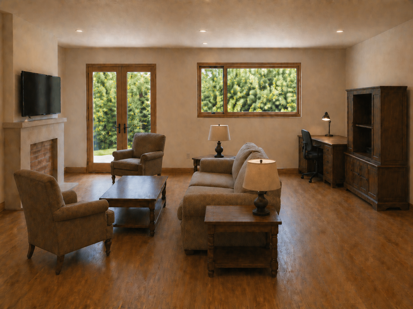
The owners knew something was wrong. They could not say what.
The square footage was reasonable. The light was decent. The bones were intact. But every time they came home, the rooms read as a series of compromises rather than a place that actually fit them. They had pinned a few hundred living-room ideas. They had repainted twice. They had bought new furniture. None of it landed.
When we mapped the existing floor plan, the reason became obvious in about ninety seconds.
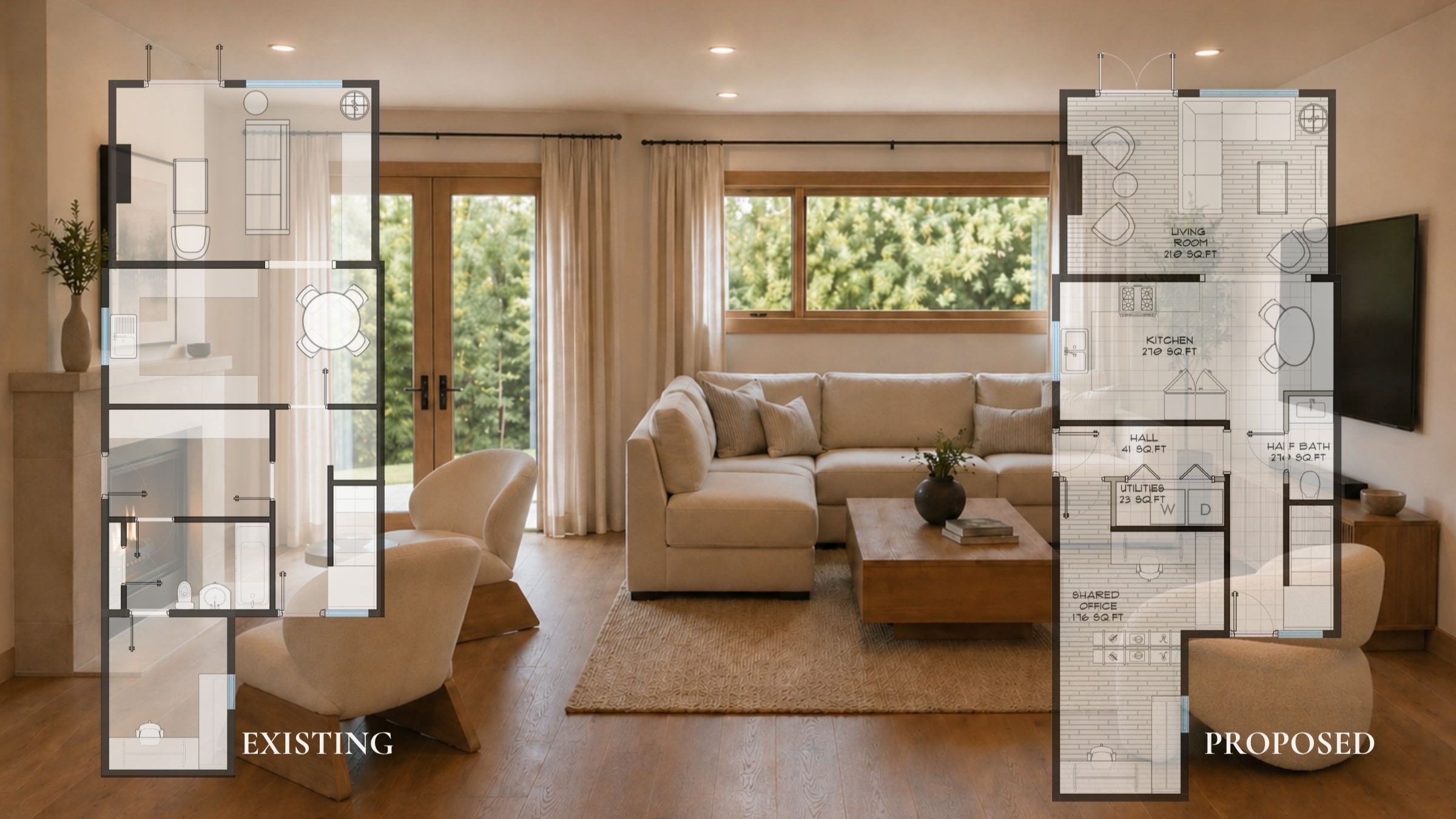
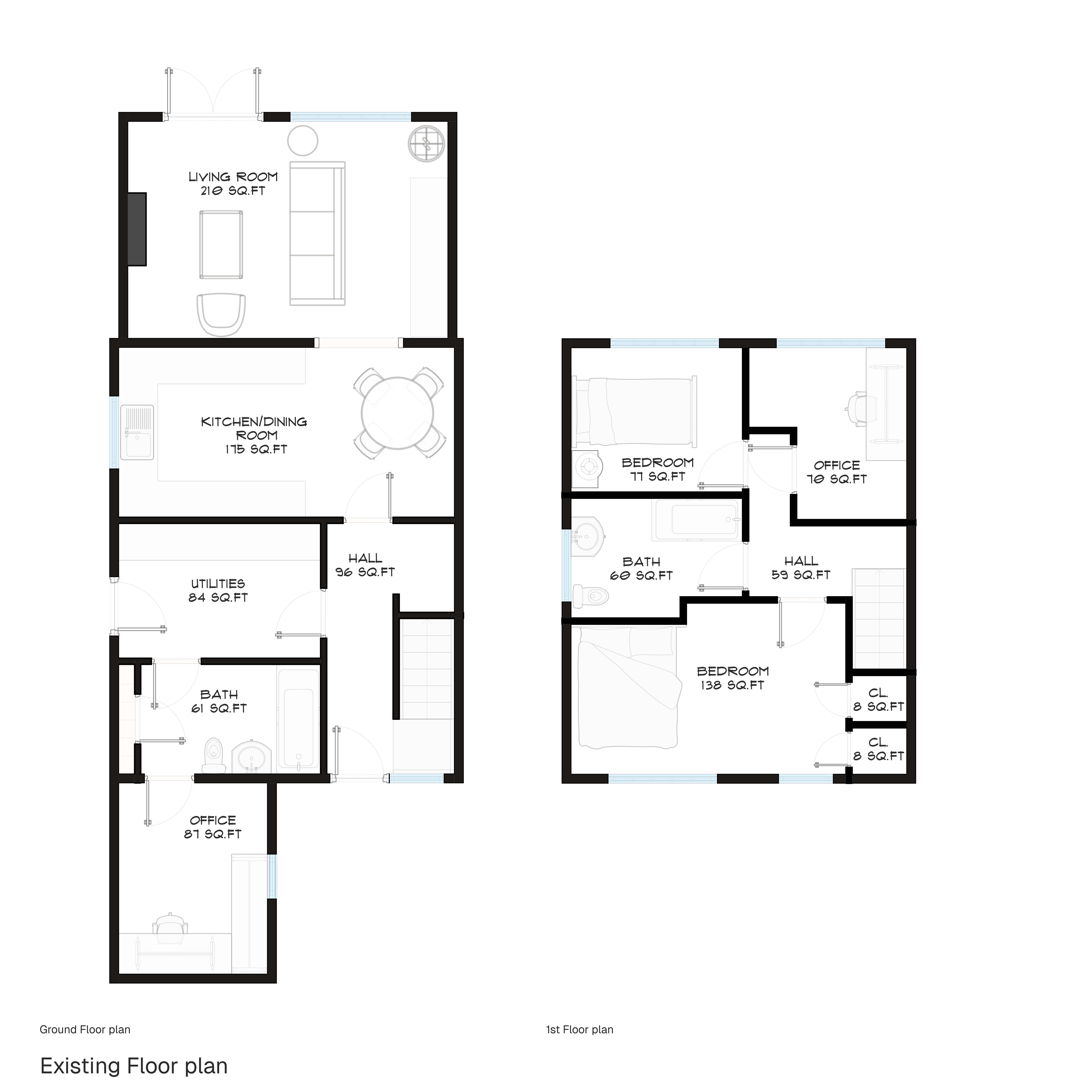
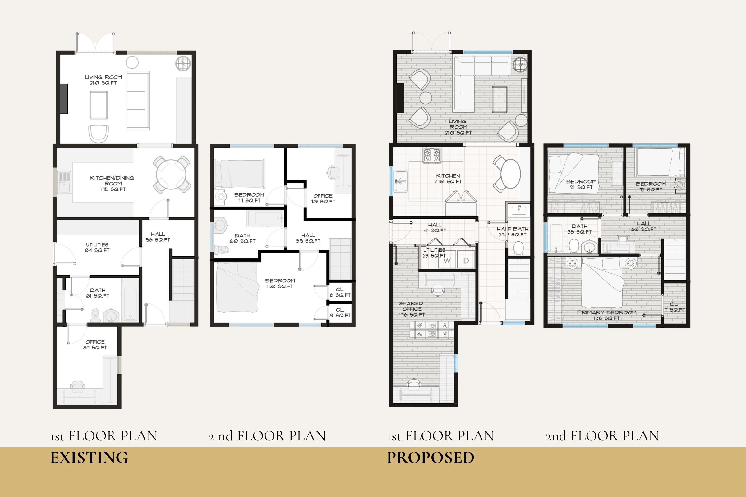
On paper, the existing layout looked fine. Two bedrooms upstairs. A long living room. A separate kitchen and dining area. A pocket office tucked at the back. A full bath on each floor. By any zoning summary, this was a functional home.
In practice it was a home that punished movement.
You walked through a 96-square-foot hallway just to get from the front door to the kitchen. The downstairs bath sat at the back of the house like an afterthought, accessible only by passing through utility space. The upstairs office (70 square feet) was usable for one laptop and nothing else. The primary bedroom had no defined closet. The kitchen and dining were fused into a single 175-square-foot zone that was too small to host and too large to feel intimate.
The owners blamed their furniture. We took one walk through and knew they were diagnosing the wrong patient.
2 — What Was Not the Issue
It was not the sofa.
It was not the paint color (a perfectly inoffensive warm beige). It was not the styling, the rug, the artwork, or the lighting.
These are the things people see, so these are the things people blame. But finishes are downstream of geometry. If the geometry is wrong, no amount of styling can save the room — you can spend twenty thousand dollars on furniture and still feel uncomfortable in a space that is asking you to walk around the sofa to reach the dining table.
"The layout sets the ceiling on every other decision you will ever make in that home."
3 — What Was Actually Wrong
When we annotated the existing floor plan, four problems surfaced clearly.
Broken circulation. The path from front door to kitchen ran through a 96-square-foot hallway that performed no function except getting you from one room to the next. A hallway that big is a room that is not a room — it is wasted square footage masquerading as architecture.
Isolated rooms. The downstairs office sat at the rear of the house behind the bath and utility zone. To use it, you had to commit to leaving the social parts of the home entirely. The dining table was wedged into the kitchen with no breathing room from the cooking surfaces.
Cramped zones. The 70-square-foot upstairs office could hold a chair and a small desk and nothing else. The 60-square-foot upstairs bath was awkwardly proportioned. Closets were small or missing altogether — the primary bedroom relied on standalone wardrobes.
Wasted space. Eighty-four square feet of utility room. Ninety-six square feet of hall. A bath placed where a powder room belonged. Approximately a quarter of the ground floor was performing at half-capacity.
4 — The Redesign Logic
We did not gut the house. We did not add an addition. We rearranged what was already there using four principles.
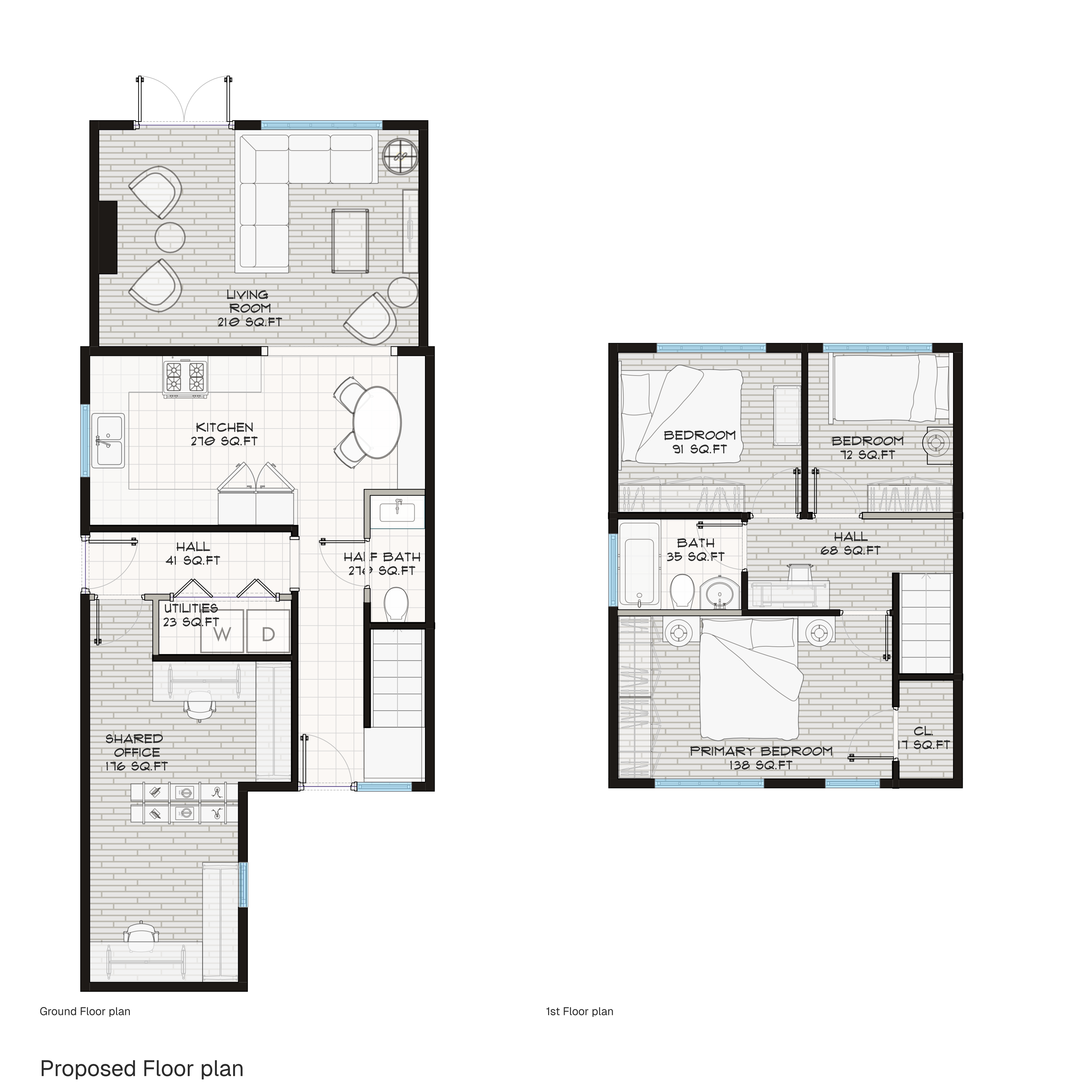
Clearer paths. We collapsed the 96-square-foot hallway into a 41-square-foot circulation node — still a hall, but one that does its job without taking the home hostage. Movement now flows directly from entry to living to kitchen without passing through dead space.
Better-connected zones. The kitchen grew from 175 to 270 square feet, gained a banquette seating area, and absorbed the dining function in a way that lets the table breathe. The downstairs office became a 176-square-foot shared workspace — more than double its original footprint — pulling square footage from the over-built utility and bath zones. It now sits adjacent to the social spaces rather than exiled from them.
Less wasted space. The 84-square-foot utility room shrank to a 23-square-foot stacked-laundry closet, which is all the space a stackable washer and dryer actually needs. The downstairs full bath became a 28-square-foot powder room — more appropriate for the ground floor of a home this size, and freed up enough square footage to enlarge the office.
Improved flow upstairs. By relocating the upstairs bath and reorganizing the second-floor circulation, we converted the existing 70-square-foot office into a third bedroom, while making the other two bedrooms vastly more usable and accessible. We then added a combined 59-square-foot of closet space to the three bedrooms — something the existing plan had simply omitted.
The math is the part homeowners tend to find surprising:
| Metric | Existing | Proposed | Change |
|---|---|---|---|
| Bedrooms | 2 | 3 | +1 |
| Powder room (ground floor) | 0 | 1 | +1 |
| Office square footage | 157 sq ft (split) | 176 sq ft (consolidated) | More usable |
| Kitchen square footage | 175 sq ft | 249 sq ft | +42% |
| Hall square footage (ground) | 96 sq ft | 41 sq ft | −57% |
| Bedroom closets | 16 sq ft | 59 sq ft | +268% |
| Total footprint | Unchanged | Unchanged | Zero added sq ft |
5 — Before / After
The clearest way to see the difference is side by side.
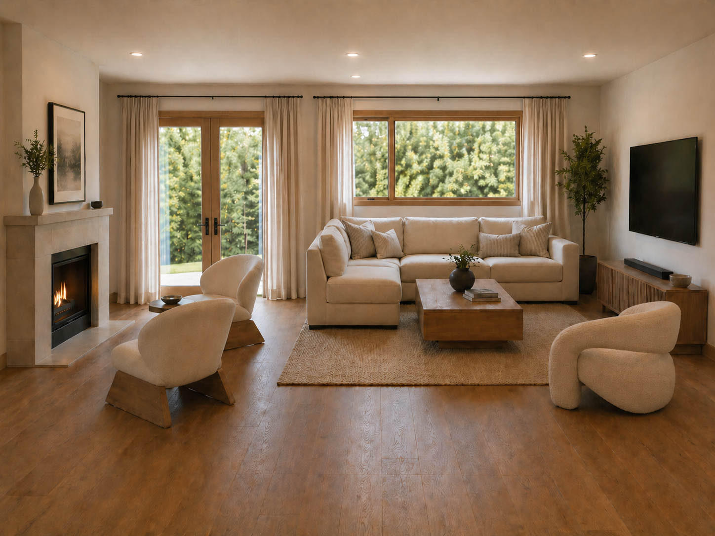
The living room is the most instructive comparison. We did not enlarge it. We did not change a single wall. We changed where the sofa, the chairs, the coffee table, and the entry path lived in relation to one another. The result reads as calm because the geometry stopped fighting itself.
6 — The Takeaway
Fix the layout before the finishes.
This is the hardest piece of advice for most homeowners to accept, because layout feels permanent and finishes feel actionable. Paint is a Saturday. Furniture is a delivery date. Tearing into a plan is a conversation with an architect, a permit, and a contractor — and that sounds expensive.
It is, in fact, the cheapest decision you will make on the entire project. Layout determines whether everything downstream is fighting you or working for you. A good plan makes a modest budget feel generous. A bad plan makes a generous budget feel modest.
7 — If This Sounds Like Your Home
Most of the homes we redesign do not need additions. They need reorganization. A virtual design service is the fastest way to find out which one you are looking at.
Start with a layout conversation.
For $150, our Style Guide gives you a curated palette and direction. For $350, our Room Redesign delivers a furnished plan and shoppable list for one room. And for $1,200, the Full Home Concept covers a layout-level look at why your home feels the way it feels — and what to change to fix it.
See the Virtual Design Packages